|
You've seen this style of logo since you were a child. They are called script logos and are a part of modern culture. Script logos are associated with baseball teams. They are also identified with beer, cars, motorcycles, soft drinks, restaurants and pubs. Even super heroes such as Wonder Woman have script logos. Where did logos come from? Thank the ancient Greeks (If you see any, thank them for me) The word logo comes from the Greek word logos, and basically means "word" although it has a much broader definition than our English equivalent. It can be found in the beginning of the Gospel of John in Greek where it says "In the beginning was the logos." The logo's cousin, the icon comes from the Greek word eikon which basically means "image". So technically an icon ought to be an image with no text, while a logo ought to include text. But this distinction has been blurred to the point where nobody follows it anymore. A logo can be a pure symbol with no text (ie. Apple and Nike) and the icons on your computer can have text in them. By the way, Nike is Greek for victory The first script logo A bubbly account
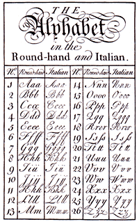
The original Bass Ale trademark was a red triangle with a beautiful signature in thick and thin strokes that looked like it had been written in ink with a very flexible quill pen in the round-hand style.
The trademark has evolved with time and the current red version is a beautiful example of a script logo -- the first script logo in history. An American logo revolution More bubbles... The next script logo I found in history came 10 years later, and this one originated in America. The Coca-Cola logo was originally created in 1885 or 1886 by Frank Mason Robinson who utilized Spencerian script, a very popular writing style in Spencerian script was famous for flourishes which writers were free to add. Like round-hand, Spencerian script was usually rendered with a very flexible nib pen that gave wide lines when pressure was applied for variety of thick and thin strokes. Pepsi Cola also came out with a very nice red script logo but later took their logo design in a different direction.
A big hit Right out of the ballpark! The influence of the script logo style continued to expand.
Triumph Motorcycles had a script logo from as early as 1907. The Ford script logo has been around since 1912.
The Philadelphia Phillies came up with their script logo in 1943. The New York Mets have had a script logo since 1962, and the Atlanta Braves have been using one since 1967. The Oakland Athletics have had theirs since 1968. The Kansas City Royals have used theirs since 1969. The Baltimore Orioles have a healthy modern looking script logo which was first introduced in 1992. The Houston Astros have gone to a script logo even more recently, in 2000. The Milwaukee Brewers also introduced their script logo that year. Theirs is a particularly impressive example of a script logo, but then again, we should expect nothing less from an entity which represents both the world of baseball and the world of beer! Many of these logos went through some design evolutions to modernize them while retaining their script look. The Minnesota Twins have a logo with a swash (paraph) but it is more squared in style than the Spencerian types (it is still a very cool logo). The term script logo has been expanded to include practically any logo that has a name in a decorative font whether it is script or not. The Pittsburgh Pirates had sort of a script logo from 1987 to 1996 but the current version is a more squared font although some still call it a script logo. The San Francisco Giants had a nice script logo from 1947 to 1982 but they then went with a squared font as well. The San Diego Padres went in the other direction, having used a squared script logo for 18 years until they finally chose a rounded true script logo in 2004. You have probably noticed a difference in the uniforms worn at home games and those worn when the teams are playing on the road. It used to be that every team wore white for home games and gray uniforms for away games. One obvious reason was that it automatically assured that the two teams would be distinguished from each other. Another reason was that teams could not properly wash uniforms for every game when the team was on the road, and dirt did not show up on gray uniforms as much as white ones. Of course, today it is much easier to provide sparkling fresh uniforms for every game wherever the team goes, but most teams still keep this tradition. Also, uniforms displayed the name of the team when playing at home, and the name of their city or state when playing away from home. Most teams still do this, as well. Remembering the history and tradition of baseball is half the fun! And there is a special sense of pride in seeing the name of your hometown done up as a fancy script logo on your favorite player's chest.
The Pittsburgh Panthers of the University of Pittsburgh was known by its famous script logo with the name Pitt for many years until they decided to transform it into the squared style in 1997. Yet a lot of fans still prefer that old script logo. There is even a web site called FansForScript.com whose mission is to bring back the Pitt Script logo.
The script logo is not limited to the adult world of sports, beer and motorcycles. The Chupa Chups lollipop script logo was created in 1969 and by none other than by Salvador Dali! I could go on and list all the teams in every sport who have a script logo, and then proceed to all the products and businesses who have adopted one, but I think you get the picture. The script logo is universal, a symbol of all that is fun in our modern culture. |
 I can't say what year they actually created it but when Britain's trademark registration law took effect on January 1, 1876, Bass quickly registered it as their trademark. As a matter of fact this was the very first trademark to be registered in Britain -- and the world (a Bass employee had waited all night to be first in line). It received trademark number 1.
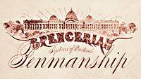
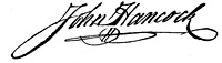 By the way, that tail like flourish that extends under the name in script logos is called a paraph. It often extends from the final letter, but sometimes from the first one. The paraph was originally used in signatures to prevent forgery. John Hancock's paraph became famous.
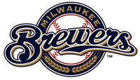 The
The 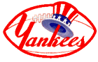 Baseball is not the only sport that has embraced the script logo. Football teams are usually more associated with the squared type logo, but there are NFL football teams who use the script logo, such as the
  Among basketball teams, the Los Angeles Lakers had a great script logo for a few years in the 1960s.