Inspiration from Franklin Booth
I have previously mentioned some of my art heroes, but number one on my list is Franklin Booth (1874-1948).
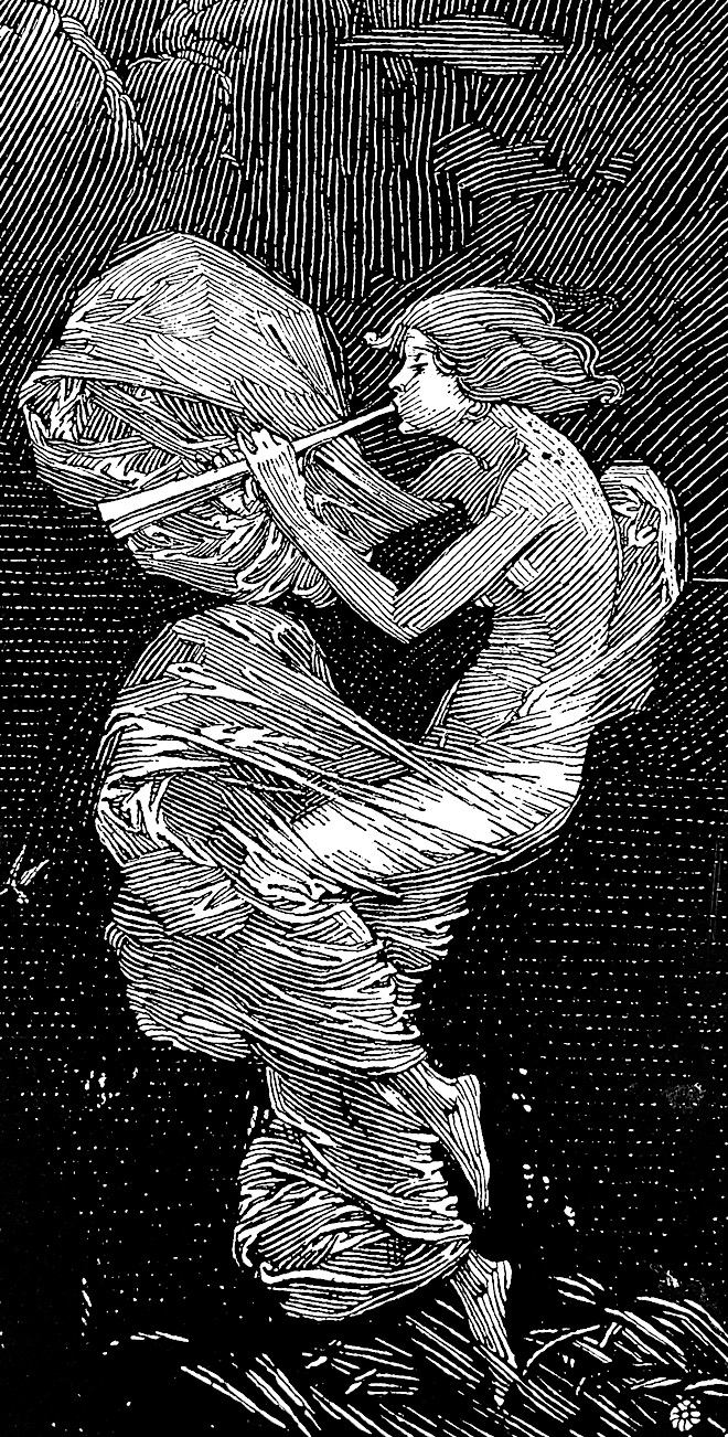
His pen and ink style was inspired by block prints which can have a white on black appearance due to the wood engraving process.
His illustrations have a magic sparkle of white space between black hatch lines. In my opinion Franklin Booth was the greatest pen and ink artist of all time.
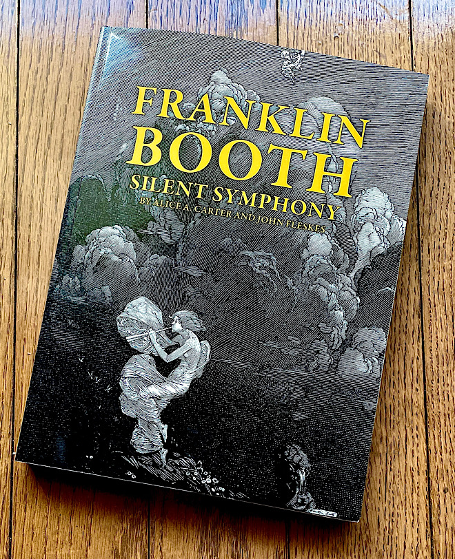
Near the end of last year (2024) I discovered a huge book called Franklin Booth: Silent Symphony which is
full of clear reproductions of Booth's work.
It contains over 400 illustrations, and many are reproduced so clearly that I can study them with a magnifying glass.
His hatching is amazing, and the direction he takes with his hatch lines is often unexpected.
(I usually upload images at twice the size for clarity, so you can "pinch out" these image to see details.)
He executed his hatching very carefully and rarely resorted to cross hatching, probably because it is not part of the block print aesthetic.
I have personally always stayed away from cross hatching, so this book really connects with me.
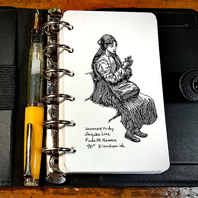
Around the same time I got this book, I also got back into pen and ink sketching (yet again) particularly with the Fude DE Mannen pens that I wrote about in a previous article.
I hadn't sketched in pen and ink for about three years, focusing instead on pencil or digital sketching.
But the pendulum always swings back.
Although I do not even attempt to imitate Franklin Booth's amazing work, I have found inspiration for my own sketches.
I no longer make art for a living, and my only form of art these days is sketching, mainly on the train and sometimes at the zoo.
So I don't want to spend my sketching time dashing off hurriedly scribbled sketches, but prefer to spend a little more time on more finished drawings.
The Return of Capture and Render
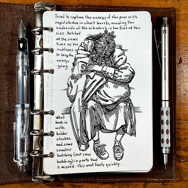
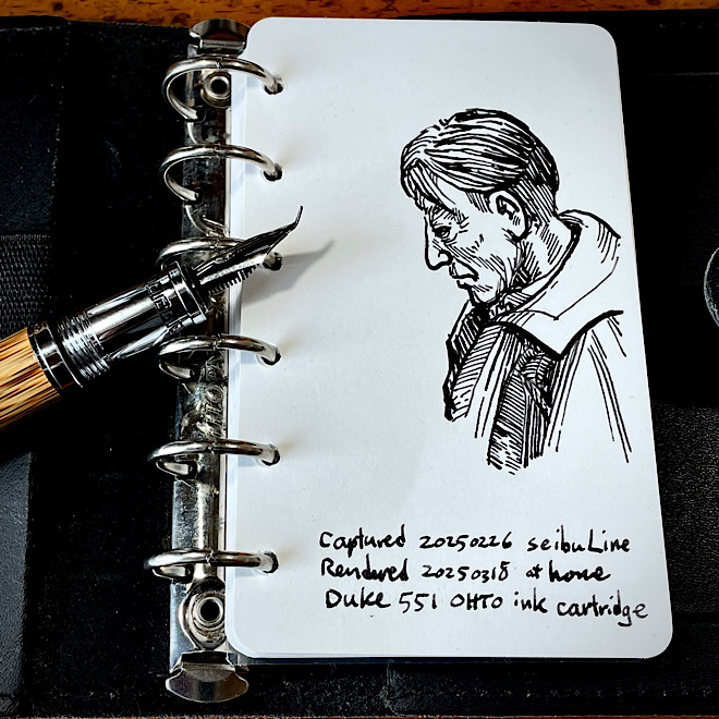
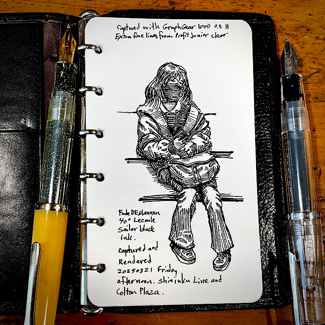
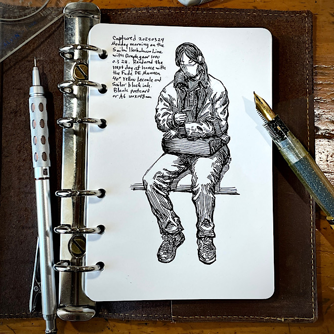
As a matter of fact, sometimes I use the capture and render method that I had written about fourteen years ago.
First, I capture the subject lightly in pencil on the train.
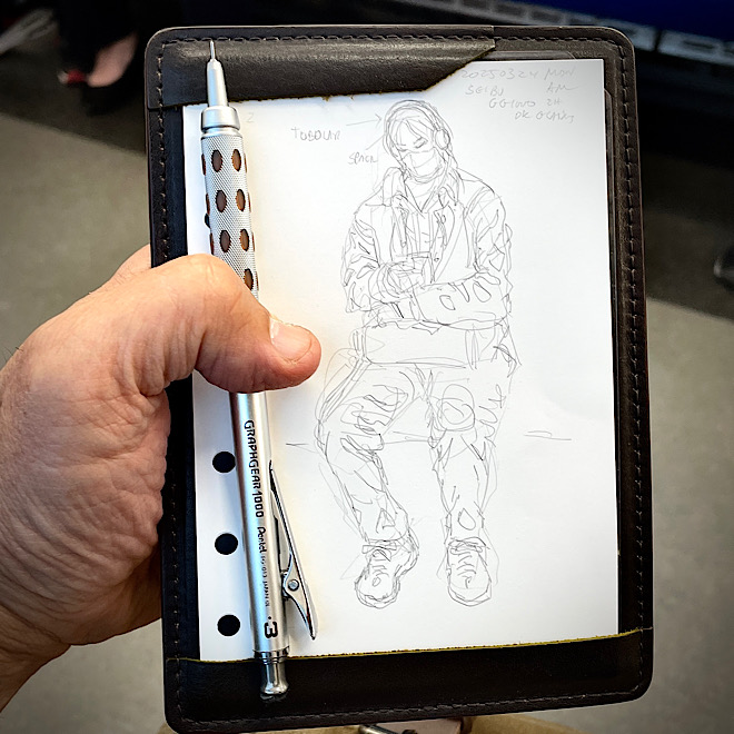
Then I wait until I'm at a table in a coffee shop or at my desk at home before I render the final drawing in ink.
Fourteen years ago, I sketched fairly heavily with the pencil as if it were just another pencil sketch. I now capture very lightly with a 2H pencil because it's easier to erase later.
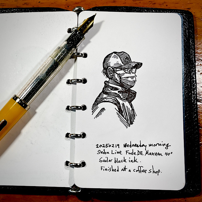
The advantage of capturing on the train and rendering at home is that I don't have to deal with a lurching train where many of the lines are drawn by accident. Not appreciated if you are drawing in ink.
And if my subject gets up and leaves, I can usually continue the sketch with another model if I am lightly sketching in pencil.
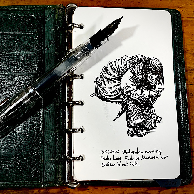
I often draw the most interesting parts first, which are usually the folds in clothing, and save the head for last just in case the model gets off the subway.
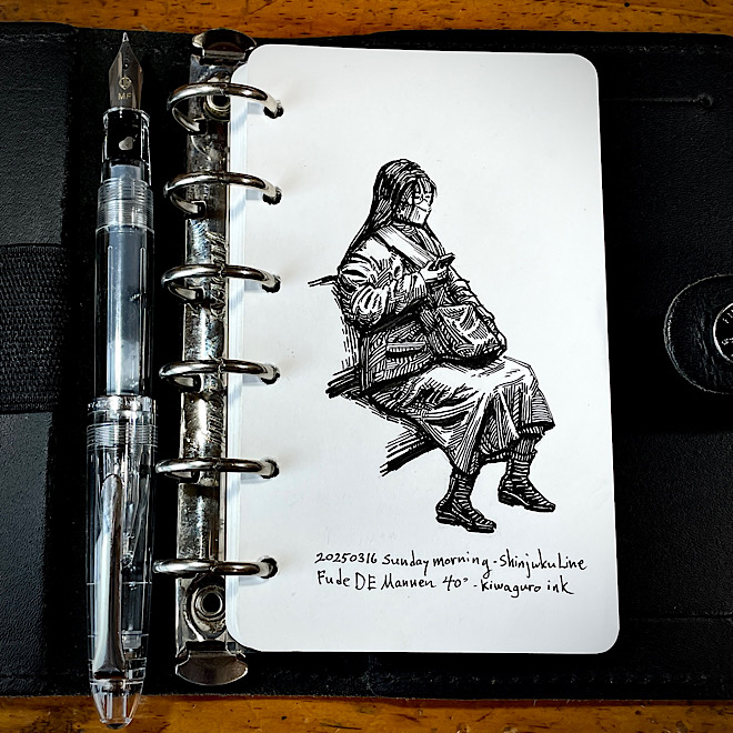
The girl in the sketch above was given a new head donated from the next girl who sat in her seat.
Actually, several of the sketches on this page have heads from a second model.
One advantage of capturing in pencil is that it takes less time, and I can finish two or three capture sketches in the time it would take to do an ink sketch.
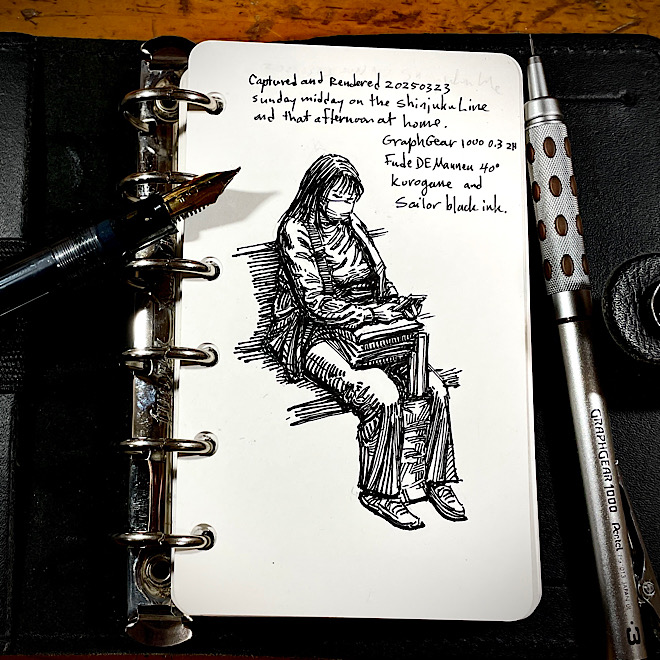
As a result I have a notebook full of pencil capture sketches that are waiting to be finished as ink sketches. Perfect for a rainy day.
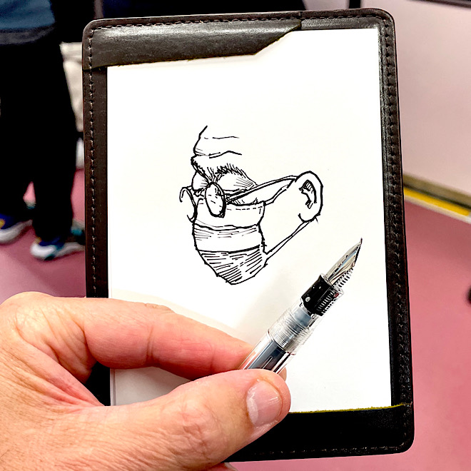
Although I usually use the capture and render method, I still sometimes dive in and sketch directly with ink because there is a thrill in finishing a spontaneous sketch on the spot.
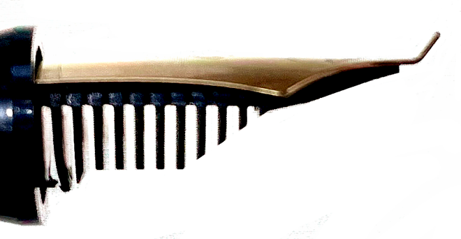
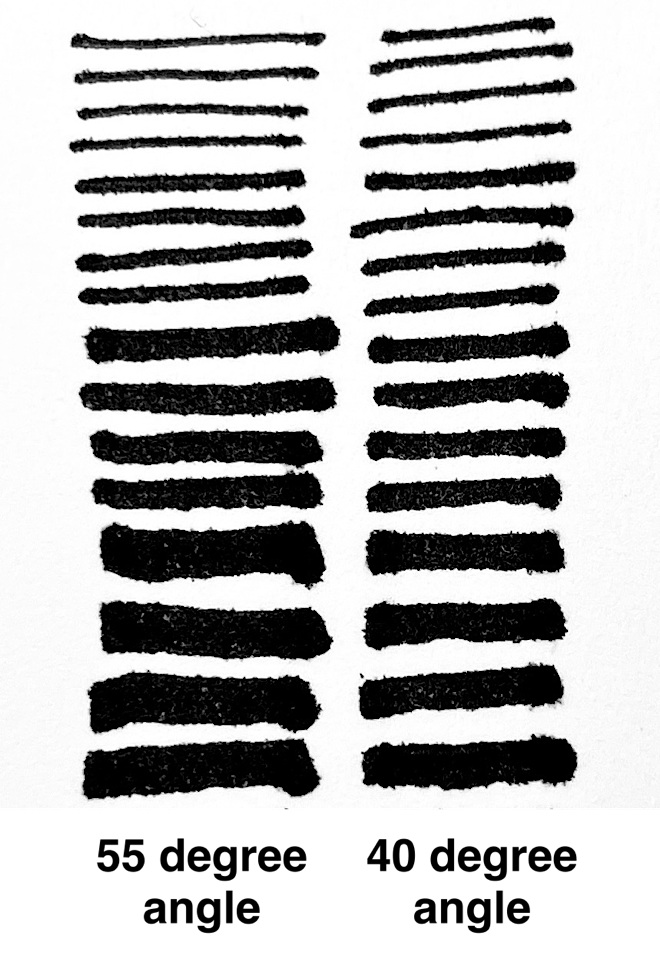
You can get a variety of line widths by varying the angle of just one pen.
The Fude DE Mannen comes in two models, one with the nib bent at 55 degress and the other with the nib bents at 40 degrees.
They both get the same range of line widths but I prefer the 40 degree model for sketching small.
The Fude DE Mannen can get a very fine stroke from the very edge of the tip when you turn the nib upside down.
Whether or not I choose to use the thinnest line possible with these pens (or the widest width) depends on the size of the sketch.
This tipping can get a very smooth line and is important to fountain pen users, but it also prevents you from getting the extra fine line of a Fude DE Mannen which has no tipping.
So the cheap and slightly scratchy feel of a Sailor Fude DE Mannen with no tipping is also the secret to getting extra fine lines.
I say "relatively" because the fine lines are not actually extra fine lines because the metal of the nib is pretty thick, but compared with the broadest line this pen can make, they are extremely fine in comparison.
Flexible Nib pens
Having praised bent nib pens for drawing in the style of Franklin Booth, I must mention the obvious fact that flexible pens are also great for this style.
Like all pen and ink illustrators at the time, Franklin Booth used dip pens and bottled ink.
For drawing outside of the home, a flexible nib fountain pen is more convenient and safer than a dip pen.
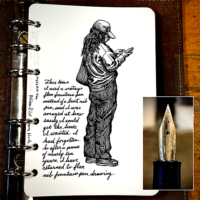
This sketch was done with a Pelikan 150 fountain pen that had been fitted with a vintage Pilot flex nib.
I was amazed at how easy it was to draw in this style with this pen.
Still, I find the Fude DE Mannen more fun to use than flex pens.
Note about Amazon links: If you click on a link and buy something at Amazon, a few pennies per dollar goes into my Amazon account, so instead of letting Amazon keep it all, you can pry a few pennies from their fingers make them share it with me. Any other vendor links I may put on this website are just for your convenience.