 | ||
|
Japanese temple bell (summer, 2006) Many old neighborhoods in Japan have a local temple or shrine with a large bronze bell. In the evening at around five o'clock (it varies with location and season) the bell chimes to signal the workers to call it a day and go home. Instead of an internal clapper, there is a long heavy log-like object suspended by ropes next to the bell. This is pulled away from the bell and released to hit the bell on the side, making a deep loud tone. These bells are loud enough to be heard from far away, and it is naturally a welcome sound after a long day in the field or factory. 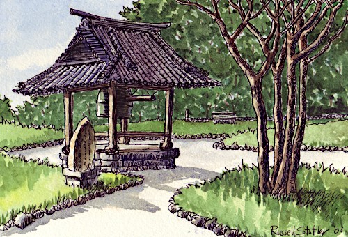 There is a large temple behind the trees, and this compound doubles as a park. The bell waits in silence in the late afternoon as the sun begins its descent in the west. This sketch was done with pen and ink plus watercolor. Japanese Shinto Shrine: Higashi Ojima Jinja Here is a sketch of a Shinto shrine on the east side of Tokyo. I confess I can't always tell the difference between Shinto shrines and Buddhist temples in Japan since they share many common elements. A shrine usually has the "jinja" suffix on its name, so I know this is a shrine because its name is Higashi Ojima jinja. 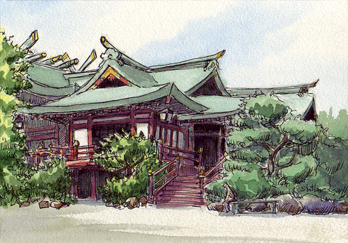 This shrine is in my neighborhood, and I have sketched parts of it in other sketches before, such as the sketch of the gates in front, but this is my first "portrait" of the entire building (or buildings). It is the oldest example of Japanese culture around these parts, and kept in good condition. I imagine when it was first built it was the most prominent structure in the area which was probably all fields. Now with its trees and open space, it is sort of an island of calm in a crowded neighborhood. This open area around the shrine is usually very quiet with only a few kids playing on the swing sets on the grounds, and often an elderly person resting on a bench, but during festivals it is so packed with neighborhood people and booths selling refreshments and goods that you can hardly move from one end to the other. This sketch was done with fountain pen and carbon ink plus watercolor applied with a Kuretake waterbrush. Pen and ink: another old liquor shop Recently I've gone back to pen and ink (fountain pen and carbon ink) for sketches of buildings. I still think brush and ink is my best tool for living subjects such as people, but with all those straight lines in architecture, nothing beats a stiff pen -- and I do love the tactile feedback that is missing when I use a brush. I've drawn detailed drawings with fountain pens since I was little, so it's sort of my home position. 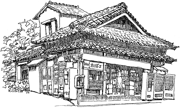 I did this one on a shopping street in my neighborhood. It was a perfect location with an open space next to a wall across the street where there was no pedestrian traffic. It's an old liquor shop, partially concealed by vending machines. I took several breaks, standing, stretching, sometimes going to the vending machines for something cold to drink; it was extremely hot! I think that's the key to surviving a long sketch -- frequent breaks! I had so much fun with this, I took my time and had to leave before I had a chance to color it. Since I drew this with the intention of adding color, it's not as finished as a normal pen drawing. For example, the dark areas are not solid black, but loosely hatched to allow color to shine through. I think neither the drawing nor the color should be able to stand on its own -- although this pen drawing does practically stand alone because I got carried away. 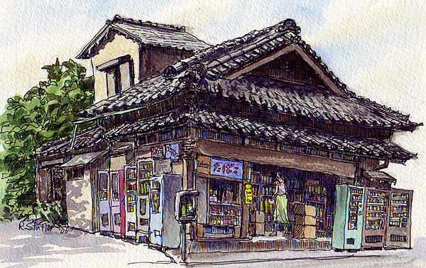 I went back a few days later and added color. Rainy season is over and the sun is shining in all its glory -- making life outside pretty unbearable, actually. This was done with waterbrushes. I found that skies are easy to paint with waterbrushes if you break the blue up with clouds, and keep it soft by wet-in-wet. I used cobalt blue and a touch or raw sienna for this sky. Overall, I tend to color darker than most watercolors I have seen, but I like the effect. Also, I tend to use a lot of burnt sienna and ultramarine combinations all over my sketches. I always run out of those two colors much sooner than the others. I usually keep one palette well reserved for these two colors with burnt sienna at one end and ultramarine at the other. I can get all kinds of colors from that one palette well. If I want a dark brown, I take it from the brown end. If I want a nice grey I take it from the middle. If I want a cool shadow, I take it from the blue end. I often add a little magenta (PV19) to the mix when I'm painting shadows to give it a slight purple hue which I think is cool. Japanese Shinto Shrine: Komatsugawa Jinja Here is another ornate Shinto shrine near my neighborhood. It stands near a street corner on an incline. This is such a quiet neighborhood, very few cars passed and almost no people walked by. 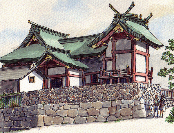 I found a nice spot across the street, shaded by some trees, and decided to take my time since I had no other plans that afternoon. First I started out drawing a very rough sketch on a smaller sketchbook of cheap paper. I did more or less a rambling continuous line drawing, concentrating on shapes and relationships rather than objects, and squinting the whole time so I could see them. These odd ideas came from Bert Dodson's book, Keys to Drawing, and they have revolutionized my drawing skills. The book is in my recommended book list. When I'm drawing simple subjects such as people on the subway, I often just jump right in with no preliminary drawing. If the subject is not so simple I'll make a preliminary underdrawing in pencil before going to ink. But with complex scenes such as this, I'll go a step further and make a quick sketch on a separate piece of paper. With a complex subject I don't really know what I'm looking at until I have drawn it once, so this my way of seeing with a pencil and pen. There are major issues I don't notice until I have struggled with them this way. For example, the roof on the right hand section is not symmetrical. The part facing inward is longer. I had assumed it was symmetrical, and couldn't get my spatial relationships with other elements right until I discovered it was not. I had seen this unusual type of roof with one side longer than the other in the past on Shinto structures, but failed to notice this one until I drew it once. Ideally this first exploratory sketch will be a value sketch as well, forcing you to decide what will be dark and what will be light, thus giving you a clear map to follow later. Or you may like this first sketch so much that you will abandon your plans to make a nicer one! 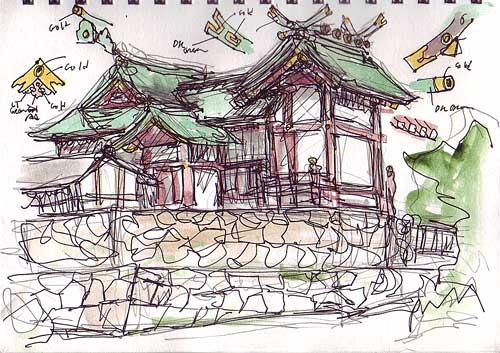 These rough drawings are good for experimenting, too. When I began the actual final sketch, this subject was no longer intimidating because I had tackled it already. Now I had both the subject and the rough sketch in front of me to guide me. I waited until the last minute to decide what parts get light and shade, and it was a good thing, too. The sun began its descent to my right, making some interesting light and shade patterns. All the sketches on this page were drawn with fountain pen and Platinum carbon ink, and colored with watercolors using a Kuretake waterbrush. |
Next page >> |
 |