 | ||
|
Page 4. Tools and materials (continued) Waterbrushes A water brush or waterbrush (some makers use two words while others combine them into one) has a soft plastic barrel which contains water. When you squeeze the barrel, water enters the bristles, thus eliminating the need for a separate water container. It also makes cleaning the brush between colors a breeze. Just squeeze water through the brush until it runs clear. These are great for watercolor sketching on location, especially when there is only enought time to make a quick sketch with no fuss. 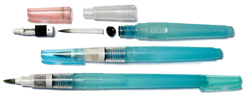 Waterbrushes started appearing in Japan during the 1990's and have become very popular around the world. In Japan they are usually called "mizu-fude" which is simply Japanese for water brush. These are basically the same design as those disposable brush pens mentioned above. As a matter of fact they evolved from those brush pens when an artist got the bright idea to empty the ink out of one and then fill it with water. Waterbrushes never go dry as long as there is water in the reservoir. As paint leaves the bristles, water replaces it, which means you can get go from dark to light to clear in one long stroke. You can start your stroke where you want the color to be the darkest and most saturated, and work your way to the lighter, less saturated areas. You can't do this with a traditional brush dipped in paint. Of course most of the time you do not want the water to paint ratio changing with every stroke. It may not be an issue when painting small areas, but it is very noticeable on larger areas. You can get around the problem somewhat if you start with a large soup of watercolor wash in your palette, and keep dipping the waterbrush in it to keep a fairly consistent mix. . Waterbrushes are best for small or medium sized works, around 9 x 12 inches or F3 size rather than large paintings. Artists who paint large works in studios will hate these, while those who paint in small sketchbooks on the spot will fall in love with them. I'm a big fan of these; All the watercolor sketches in this book were done with waterbrushes. 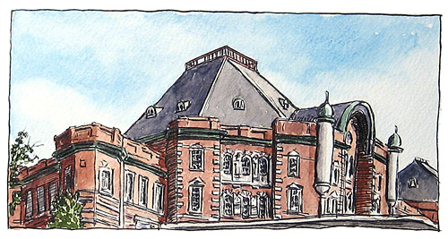 A sketch of Tokyo Station done with ink in brush pen and painted on the spot with watercolor and a waterbrush. I've noticed the on bad weather days when the air pressure is low, the water will flow more freely from a waterbrush. A little too freely, as a matter fact, and they are therefore harder to control on bad weather days. You may get a puddle of watery paint where you expected something more dry and saturated. It's good to carry a small regular brush for these special situations. Waterbrushes differ from each other in temperament, and a waterbrush that is notoriously dry on good days might be just right on bad days, so don't throw it out. Also, on cold days, the water flow will be greater as your hand warms the barrel, causing the air and water inside to expand. This can cause problems if you don't anticipate it. There's also a piston fill type water brush from Blue Heron Arts For more information, see my article My observations on the Waterbrush Watercolors
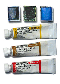
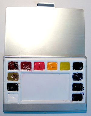
Sketching in color takes some time and preparation, and is not as spontaneous. If you are willing to sketch in black and white, you can sketch more often during the week by keeping a small sketchbook and pencil or pen available for those sudden opportunities. Watercolors come in tubes or hardened pans (or half pans). Either tubes or pans are fine for small sketches. Tubes are best for large works because you need to be able to produce large amounts of paint quickly for large washes. Art supply stores carry a wide variety of portable watercolor kits for sketchers. These usually come complete with half pan watercolors To the right is a photo of half pans and small tubes Every paint company comes up with its own names for their colors, and sometimes the colors are different from the paint of the same name from another company. Some companies also print the pigment number on the tube so you know exactly what color you are getting. For example, my tube of Ultramarine Deep has the pigment number PB29. If the pigment numbers are available, you can see if the paint is made of a single pigment or a combination of pigments. 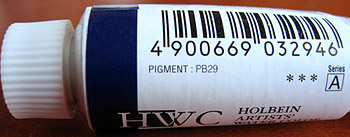 I personally like to stay with single pigment colors. Colors with multiple pigments may have give unexpected results or muddy colors when mixed with other multiple pigment colors. However, most artists use multiple pigment colors and get along just fine. I guess it's like owning dogs. After a while you know which ones will bite, which ones you need to separate, and which ones get along well. You can learn all about watercolor pigments at the Handprint web site which has had a great influence on my color choices. For more information on various brands, there's an article on the Wonderstreet blog called Which Brand of Watercolour Should You Choose?. You don't need many colors for sketching. You could actually get by with just red, blue and yellow, or maybe pairs of warm and cool versions of each of these colors. It seems that most sketch kits come with 12, 18 or 24 colors, which were based on somebody's concept of the ideal palette, so you could buy one of these sets and do very well. And these sets usually have colors which mix well with each other. But every artist has a different list of ideal colors. I get confused if there are too many color choices. A standard twelve color palette is plenty for sketching, but you can get by with seven basic colors:
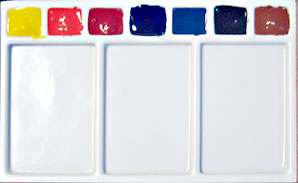
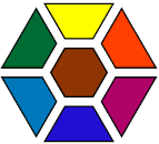
This is basically a combination of RGB (Red, Green and Blue, the three colors used in light projection, also called an "additive color model") alternating with CMY (Cyan, Magenta and Yellow, the three basic colors of printing, also called a "subtractive color model") along with one earth color. I had not set out to combine RGB and CMY; it just turned out that way, and I thought it was interesting. These will fit one of those 7 well daisy type palettes, which might be fun. I set up a quick layout with approximate colors to see how it would look.
You can mix Peacock Blue and Ultramarine for exciting sky colors. Permanent Rose and Bamboo Green make a very dark green for the dark parts of trees, and will even come very close to black. Peacock Blue and Yellow make a brilliant green for fresh spring foliage. I included Burnt Sienna because when I mix it with Ultramarine, the combination becomes magic. Use it full strength for a nice deep brown, or add a little Permanent Rose for a chocolate brown. If I add more water I can get a whole range of cool and warm grays. I use these two colors up faster than any other in my palette. Burnt Sienna is very convenient for mixing with the other colors, too. I can get a nice olive green by mixing Burnt Sienna with Bamboo Green. Add Yellow to the mix and ease up on the Burnt Sienna and you have a decent substitute for Sap Green. Yellow added to Burnt Sienna gets a nice brilliant earthy yellow that can be used where you would normally use Yellow Ochre. Add some Permanent Rose to this for nice flesh tones (of course you need to adjust for the individual skin tone). It's a good idea to take some paper and experiment with mixing the colors you have to see what new colors you can get. It's important to be very familiar with your colors and what they can produce. But it's a lot of fun playing with them to get familiar! My preference for a small number of colors is partly due to the influence the famous British artist Alwyn Crawshaw who also uses an extremely limited number of colors on location. I have several of his books, DVDs, and videos -- he speaks excellent Japanese on the videos, by the way (heh heh...) and I was always impressed at what he could accomplish with so few colors. I couldn't remember which specific colors Mr. Crawshaw was using, so I checked one of his books -- the one about his sketching holidays in Japan. I was surprised to discover they were basically the same as my seven color palette -- the book gives the color names but not the pigment numbers. Here is the list of his seven colors with mine next to it:
The big difference is that I went with Burnt Sienna instead of Yellow Ochre -- I just love that color and would be lost without it. Watercolor sketch kits There are many great portable watercolor sketch kits out there which have a good selection of colors and a palette mixing area. My favorites are the Koi sets from a Japanese company called Sakura and also the well known sets by Winsor and Newton (I've included a few links at the bottom of this page). There are also many types of empty folding palettes out there, some made of metal covered with laquer, and some are plastic. They can be filled with your choice of tube paints, and when these paints harden, they will be just like pan watercolors. Some of the newer palettes are leakproof and airtight and very portable. Home made watercolor sketch kits
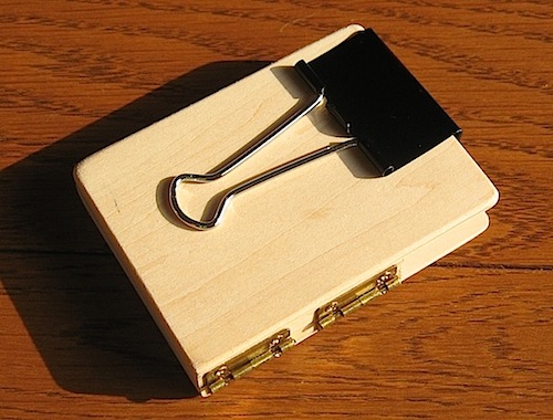
Altoids tins have hinged lids and will hold over a dozen half pans and are very popular with sketchers. A web search will turn up many web sites with various creative ways to make an Altoids watercolor kit. I personally prefer natural sketch kits made of wood, and have built my own for many years mainly because I couldn't find a commercially made one that suited my purposes. Since I often stand while sketching, I like to keep both watercolors and sketchbook in one hand while keeping the other hand free. This is nearly impossible with most watercolor kits out there (except for one made by Sakura). If you are sitting, you can just keep your sketchbook on an easel, place your tools on the ground around you and hold your paints in one hand. If you are standing, you need to grow a third arm or else come up with something like this. 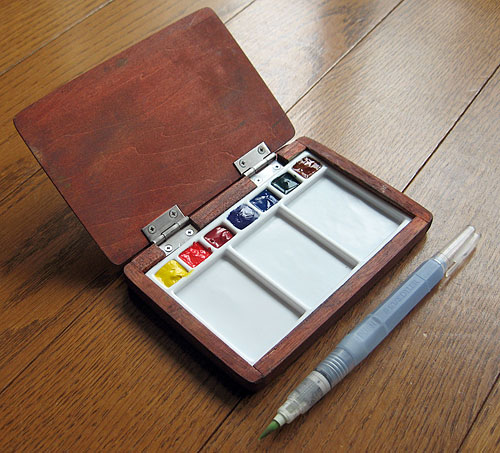 This home made sketch kit has seven wells for paints, a mixing area, and a lid that serves as a prop for a small sketchbook so I can hold both paints and sketchbook in one hand, plus a wad of tissue. My other hand is completely free. If I am using a spiral bound sketchbook, then I can wrap the sketchbook around the easel lid. Very convenient. 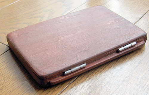 This sketch kit is about postcard size and very slim, and works well with small and medium size sketchbooks. Of course, it's perfect with postcard size sketches. A small strip of extra wood under the hinges props the lid open at an angle. This kit has gone everywhere with me. These boxes are made with wood that is thin enough to cut with a snap blade cutter knife that can be found in most artists' desk drawers. I glue the parts together with white craft glue and then sand the surfaces and joints smooth. They are incredibly crude in appearance until I've sanded them! Tiny sketch kit Here's a tiny home made kit which can travel in the pocket which makes it great for unplanned sketch moments. Since seven colors don't divide into rows, this one has nine wells with the addition of two colors:
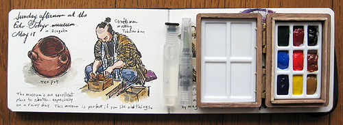 Next to the kit is a tiny Sakura Koi waterbrush, which is very portable because it comes apart and has a cap for the barrel. This kit is perfect for coloring sketches when you are sitting in a coffee shop. However, it is a bit awkward to use if you are standing since it will slide off the page. Clip-on sketch kit for the watercolor Moleskine The small watercolor Moleskine pictured above is the sketchbook I keep coming back to because of its nice watercolor paper. However, it has a long unwieldy horizontal design which can be distracting if you try to balance it in your hand together with a watercolor palette. So I set out to design a watercolor kit exclusively for it. I found some extra large clips in an office supply store and discovered that if I could clip the palette to the opposite page of the Moleskine, I could hold everything in one hand. The main objective was to provide a space for the clip. 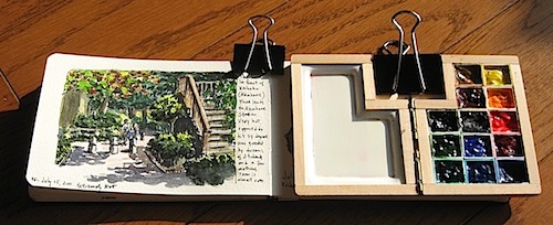 When open, this kit is the exact same size as one page of the pocket watercolor Moleskine The half pans were cut down to about 5 millimeters high. An extra clip in the middle keeps the book open and stiff to give it balance and keep it from flopping. If I'm creating a double page spread or different sketchbook, I can clip this to a drawing board or any "clippable" object for stability. 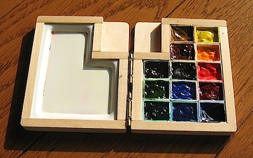 Since I had the space, I brought the number of colors up to thirteen. When the mixing area is small, it is convenient to have a few extra colors.
 It all folds up to half the size of my watercolor Moleskine. A simpler version This kit is very similar to the clip-on type above, except it has no clip space. It's good for when I'm sitting at a desk, coloring sketches I painted elsewhere. It uses the same trimmed down half pans from the kit above. That's the one big advantage of using pans rather than filling empty wells directly with paint. If you want to move the colors to different spots or try new colors, you don't have to gouge and scrape out paint; just remove the entire pan. A little double sided tape keeps all the pans from popping out. 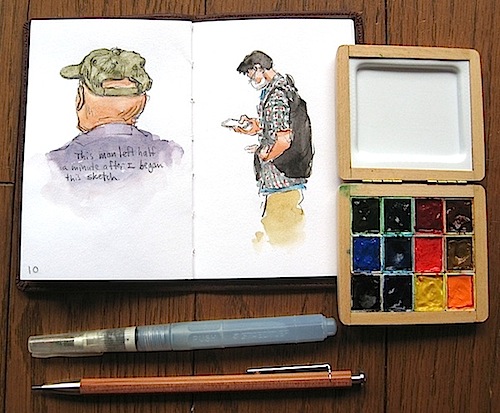 Trading card size palette Here are photos of a recent palette kit I made to fit my small trading card size sketches which are 2.5 x 3.5 inches (A.K.A. ATC or ACEO). The screws holding the hinge to the lid were protruding, so I filed them down (I also filed down the screws in the first home made box that appeared above). 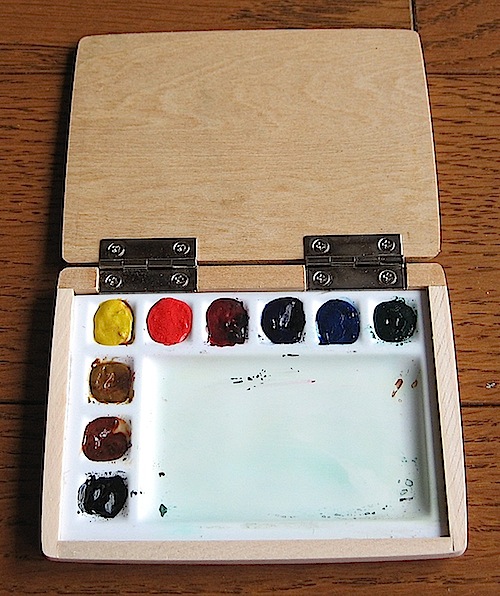 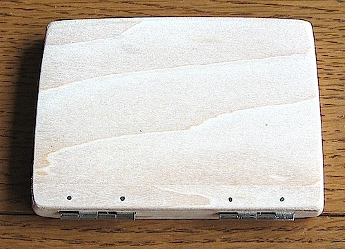 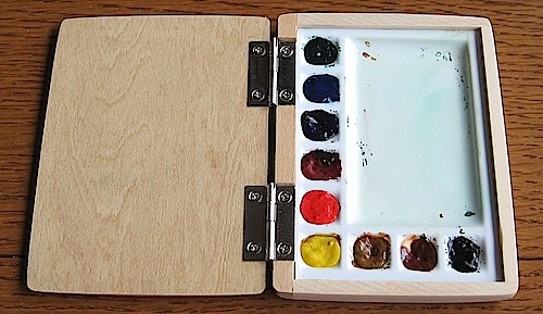 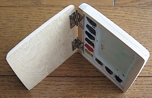 Non-vacuum-form palette box The molded plastic parts on these sketch kits are also home made, and the next page gives some details on how to make a plastic palette by vacuum forming, which is the most challenging part of making a sketch kit. For those who don't want to mess with vacuum forming -- which is probably the majority of people on the planet -- here is one that was glued together, so there was no need to do any vacuum forming. you can useI simply used plastic (polystyrene) sheets Also, do not apply this glue with a cotton swab because they say it can burst in flames. Really. I read that after I used a cotton swab, but fortunately nothing happened in my case. There are enough frustrating moments in a typical woodworking project even without having something burst into flames. You can also plastic model glue with polystyrene, and it will melt and fuse the plastic for a very strong bond. As with the other kits, the wood parts were glued with white craft glue (PVA). 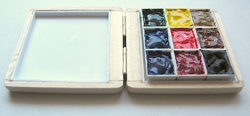 These are standard half pans (not the ones I trimmed down to half height). They make a nice square which are attached to a square sheet of plastic with double sided tape to keep them in one unit which I can remove from the box if I need to. Since there is space in the recessed lid, I can keep the walls half the height of the pans. You just have to take into account the fact that the sides of the half pans are not perpendicular, but slant outwards so the tops are larger than the bottoms. This means you need to give some space around the pans so the lid can close properly. Business card size palette Here's a very portable kit. For this one I used a standard aluminum Japanese business card case. There are so many products in Japan which conform to the standard Japanese business card (meishi) size which is 91mm x 55mm that it would make sense to go with this size if you are sketching on small cards in Japan. You can find a wide variety of meishi cases, jotters, albums, notebooks, sleeves, picture frames and blank cards. In the years since I first published this page I've noticed on the web lots of photos of business card case watercolor palettes very similar to these, and some are even for sale. I came up with this idea around 2007 and posted these photos in 2008. Does that make me the first one to think of this idea? Glad to hear that it has caught on. For this one I added regular half pans which were sanded down in height. They are held in place with double sided tape. The mixing area is just a sheet of white plastic with walls glued on with Cyanoacrylate glue. 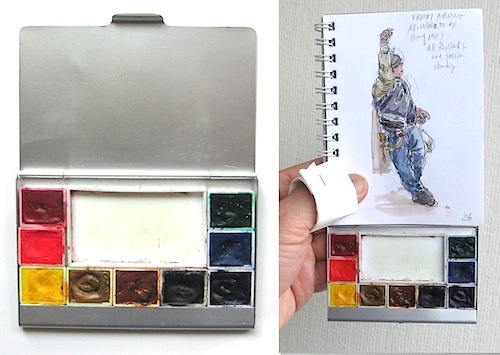 This fits in my pocket. Here it is with my small pocket sketch book. Of course, it is also perfect with meishi size cards which are the exact same size as the lid. And, no, I did not injure my thumb. That's a loop of tissue paper, folded over lengthwise a few times, cut in half, and stapled together to fit on my thumb when painting. When flat, it fits in the mixing area of the palette. Twelve-color business card size palette Here's the same Japanese business card case with a nice balanced twelve-color set that covers all the bases on a color wheel plus a few convenience colors. All are single pigment colors. For this one I used a vacuum formed plastic palette.
I include black because in Japan so many people have coal black hair and wear black clothes and shoes and carry stuff in black bags and backpacks. I also include an opaque Titanium White because Japanese clothing often has a pattern of fine white images on a color background. I have always resisted using white paint on watercolor sketches in the past, and even now I use white very sparingly and carefully. Actually, I've found that an opaque white gel pen is much more reliable and quicker to use for adding white details such as the dots on the girl's blue dress and the pocket button on the sleeping girl's denim jacket below. 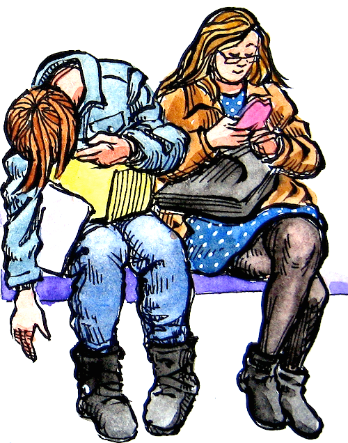 For this sketch I used a Uni-ball Signo Angelic 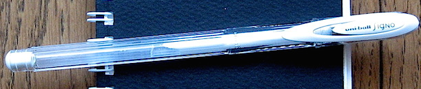 But I'll keep the Titanium White in my palette for those times when I don't have the gel pen in my pocket, or when I want to mix it with other colors to make opaque accents such as pink strips or yellow dots, etc. Hopefully these examples will spark ideas for your own watercolor sketch kit to suit your particular needs using whatever materials may be available to you. If you set out to design something like this, start by measuring the non-negotiable dimensions which can't be changed (such as the watercolor pans) and use those measurements as a foundation from which to build your design. The next page talks about making vacuum-formed plastic parts, which may or may not interest you. You can always skip to the page after! Here are Amazon links to products mentioned on this page: |
 If you keep a busy schedule, you may have to accept the fact that the majority of your sketches will be in black and white. Of course, you can color them later when you find the time. Color is exciting, and when you do have the time and opportunity, sketching in color is very rewarding.
 My paints are made by Holbein except for Transparent Yellow and Permanent Rose which are made by Winsor and Newton. Holbein is a local product for me and cheaper than Winsor and Newton. However, they do not make a yellow with PY97, and their version of PV19 is very dull. Winsor and Newton have discontinued their Transparent Yellow (PY97) so when my hoard is depleted I'll have to find another yellow ; I'll probably go with Cadmium Yellow.
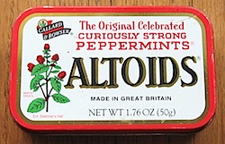 If you think you will not be satisfied with the various sketch kits out there, you can always make your own from a variety of boxes that are divided into sections such as small pill cases or empty eye shadow cases.
Next page >> |
 |