 | ||
|
Page 13. How to Sketch (continued) The traditional method of drawing you find in a lot of books is to map out all the angles and relationships and perspective lines and basic shapes very systematically. Lots of cones and cubes and spheres in a matrix of perspective lines radiating from a vanishing point. This method can be very frustrating if you get the basic relationships wrong in the beginning, or miscalculate the location of vanishing points. Then you have to keep building on an increasingly shaky foundation. You also end up with a lot of construction lines that need to be erased later. I've pretty much abandoned this method for the following method: Rambling continuous line contour drawing Take your pencil and start drawing exactly what you see in front of you as if your eye were a camera, tracing lines as you see them, and always staying aware of spatial relationships and angles. It does not matter how the objects are constructed, or what is behind them or even what they are.
Try not to lift your pencil because it gives you one more way to measure and verify distances as you feel it travel over the paper. Just let the pencil ramble over the paper in a continuous line. If you come to the end of a line and have nowhere to go, you can simply reverse direction and retrace it to get going in a new direction. (I confess I often break this rule and lift my pencil when needed). You can keep the initial pencil lines very light, and if you make a big mistake, simply redraw without erasing. These mistakes are much more attractive than construction lines, and add interest to the sketch anyway. You can draw as slowly as you need. In the long run this method will probably take less time than the traditional method, and be much more accurate -- and interesting. People call this method "contour drawing" or "taking the pencil for a walk" and several books have been written on the subject. My favorite so far is Keys to Drawing by Bert Dodson. This type of contour drawing almost forces you to draw exactly what is in front of you. If you add or subtract or rearrange the elements, then you have rely on a combination of imagination and what is actually there in front of you, and things get very confusing. Squinting It also helps a lot to squint so you can see dark and light areas easier. Squint when you are looking at the subject,and even squint when you are drawing. If you are near sighted, try sketching with your glasses off. The subject may be just blurry enough to allow you to see the big areas without clutter. Of course, you may need still need the glasses just to see your paper.
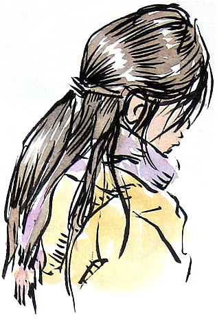
Beauty of line This book obviously reflects my personal bias; who the heck talks about beauty of line in a book on sketching? Well, it was a distinguishing feature in the old brush and ink sketches of Japanese masters such as Hokusai and Hiroshige, and I think it's worth mentioning -- and pursuing. After you have established the spatial relationships lightly in pencil, you can then focus on beauty of line if you want to. You have the option of keeping every line of uniform width, or you can vary the line width by adding pressure. This will work with a pencil, fountain pen (depending on the flexibility of the nib) and a brush. The pencil will give you very subtle line variation, while a flexible nib fountain pen will give considerably more. I'll focus here on the brush here since it is the ultimate tool for line variation. If you are sketching people you don't know and will never see again, you might be able to skip the pencil drawing and concentrate on beauty of line. The sketch itself is more important than getting an accurate likeness -- although you will probably want to make sure it looks like a human being. If you have never experimented with line variation, try to draw a few lines and arcs, keeping the pressure light on the ends and heavy in the middle. Then try to make them thin at one end and thick at the other. When I encouraged my kids to try this, I called these magic lines because they are the same types of lines used in the old Disney characters and American comics to give them a magical quality.
Hand drawn sketches by Hokusai are relatively few, but there is a museum in Obuse, Nagano-ken which is full of sketches and paintings done in his own hand, and well worth the trip to see them. It is much easier to locate and study his wood block prints, which number in the thousands. These are the work of carvers and only based on his original brush sketches, but the top wood block carvers of the day were amazingly accurate, striving to represent every stroke faithfully, and this was especially true in Hokusai prints, since he was very demanding, and oversaw the carving process, having started out as a wood block carver himself. I recall a humorous scene in a film about Hokusai's life where he was angry with the wood carver, pointing at the freshly carved block, and raging about how lines were not alive. In response, the carver with a sullen expression took his mallet and broke the wood block in two. Creating "living lines" was a priority with artists back then. In light of this rich heritage, I find it amazing that most modern Japanese sketchers who publish books on sketching or sell prints of their sketches seem to prefer micron type pigment pens with unvarying line widths. I look at these and think "Yes, it's a nice sketch, but how much more exciting it would have been had the Japanese artist drawn it with brush and ink."
Of course, you don't have to imitate Japanese calligraphy conventions to create a lively sketch. My own style is a far cry from that of Hokusai. But most artists could benefit from getting hold of a book of old Japanese drawings and copying them in order to get a glimpse as to what they were thinking.
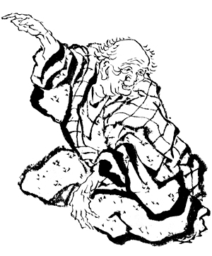
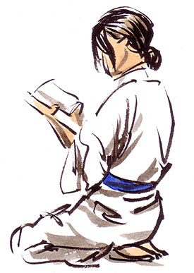
I envy those old Japanese artists who lived in an era when everyone wore kimono. All that loose fabric makes for great brush sketches. Tight modern clothes are less exciting for brush sketchers. One place where you can find models relaxing in kimono today is a Japanese hot spring hotel. The main attraction of these hotels are the baths which are fed from natural hot springs. All the guests wear yukata (cotton kimono for summer) supplied by the hotel and can walk around the hotel or the surrounding neighborhood dressed this way. The sketch on the right was done in a large room where guests could relax after the bath. There were shelves of manga (Japanese comics) and several people totally absorbed in reading, paying little attention to the guy with the sketchbook. This sketch was approximately 85mm high (3 1/4 inches) and was done in a few minutes before the model changed her pose. I started out with my Sailor Profit brush pen, starting at the head, and working my way down to the feet. Then I added gray strokes using Private Reserve Gray Flannel ink in Platinum ink converter in a Kuretake brush pen. Later I added a little watercolor. See page 3 for more information on brush pens, inks and converters. Disconnected lines with a brush Since a brush will give lines of varying widths, you don't have to connect them all; all that tapering allows the imagination to fill in the missing parts. Just draw lines where they are needed and let the imagination fill in the missing lines. On the sketch of the sleeping guy below on the left I made no effort to connect the lines (by the way, he was "dead to the world" and had no idea I was sketching him although everybody else on the subway knew).
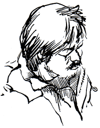
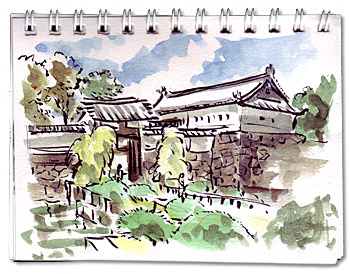
Hatching I find that lively lines of varying width are great for outlines while lines of consistent width are very attractive for shading by hatching. Together these make a dynamite combination. One of my favorite styles is combining bold brush outlines with fine hatching, whether from a pen or brush. I try not to cross hatch because the beauty of hatching is the space between the lines, and cross hatching reduces the effect and makes the area look too busy. The sketch of the guy above on the right (also done on the subway) includes fine hatching in the shadows. The outlines and hatching were done with the same brush pen. The flying turtle fountain below has outlines done with a brush and hatching done with an extra fine nib fountain pen. 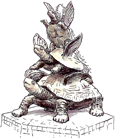 Trial sketches in brush and ink I've already mentioned trial sketches in pencil and watercolor, now here are a few exploratory sketches that emphasize line variation with brush and ink (brush pen) and watercolor on top of a quick scribbled pencil under drawing. This is one of the gates to the Edo Castle grounds. This one is the Otemon (big hand gate). Here is the quick exploratory sketch. The sketchbook is my usual cheap pocket sketchbook measuring 5 X 3 3/4 inches (12.8 X 9.5 cm). I decided I liked this subject, so I unfolded my stool, sat down, and made the sketch below which took about 50 minutes. This one is a bit larger, 6 3/4 X 4 3/4 inches (17 X 12 cm). Some passers by were more interested in the smaller sketch. 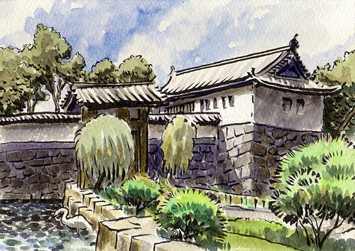
I decided this one would also be worth taking a little time in a larger sketchbook, so once again I pulled out my stool and did the sketch below. It was cloudy, but the sun came out as I started the larger sketch. As I sketched this one, a blimp flew by and dominated the sky in the background. I had not seen a blimp for several years, but decided against putting it in the sketch. Not only would it have been severely distracting, but who would believe it was really there? 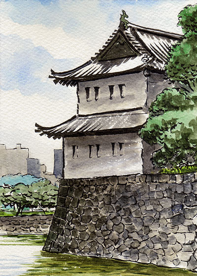 This sketch was done with the Copic Gasenfude brush pen. |
 To the left is a self portrait of Hokusai (1760 - 1849) done in brush and ink. He included it in a personal letter when he was an old man. When it was on display at a museum in Tokyo I studied it for the longest time. See how every stroke is alive in this little sketch?
  The strokes in these old drawings are very similar to Japanese brush writing. In brush writing, the strokes are not haphazard; as students learn each kanji character, they also learn which part of each stroke is supposed to be thick or thin, and whether the stroke tapers off, or ends abruptly. You can see these same calligraphic strokes in Japanese ink drawings, which gives them a unique charm. One could say Japanese students in Hokusai's era had a head start when they turned to drawing, having already been educated in brush work, which they could easily apply to drawing.
 A contemporary source of inspiration and instruction in brush and ink drawing can be found in modern American style comics (interestingly enough Japanese manga artists prefer pens over brushes). The art of Will Eisner (creator of the Spirit as well as many graphic novels) is a great example of what can be done with brush and ink in the hands of a master. His powerful expressive brush line technique could easily be applied to sketches -- his art always has a free, sketch-like feeling. Even his hatching was done with a brush.
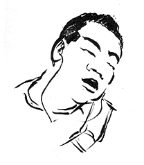
 Appearing below these are the more completed sketches, also done with brush pen. Sometimes the small quick sketches are more fun, and turn out better. I emphasized brush lines in these, letting the brush do the work. These are really fun to do, and the brush lets the whole thing come alive!
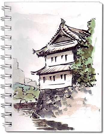 Here is a sketch of Tatsumi Turret (also called Sakurada-Niju Turret) which sits on the wall of the same castle grounds just a few yards from the Otemon. It's in the same pocket sketcbook as the one above. Most people in Tokyo don't know this structure by name, but will recognize it easily enough.
Next page >> |
 |